When creating multilingual product detail images for different cross-border e-commerce platforms, do you often encounter the following issues?
- The translated text overlaps with and disrupts the original design due to length.
- The color of the translated text lacks enough contrast, making it hard to read.
- Some key information in the image needs special emphasis in the translation, but you don’t know where to start. Now, let us introduce Piclaza’s Refinement Tool, which not only perfectly addresses the issues mentioned above but also enhances the design appeal of translated images and adds a commercial touch.
Piclaza’s Refinement Tool.
Access to the Refinement Feature.
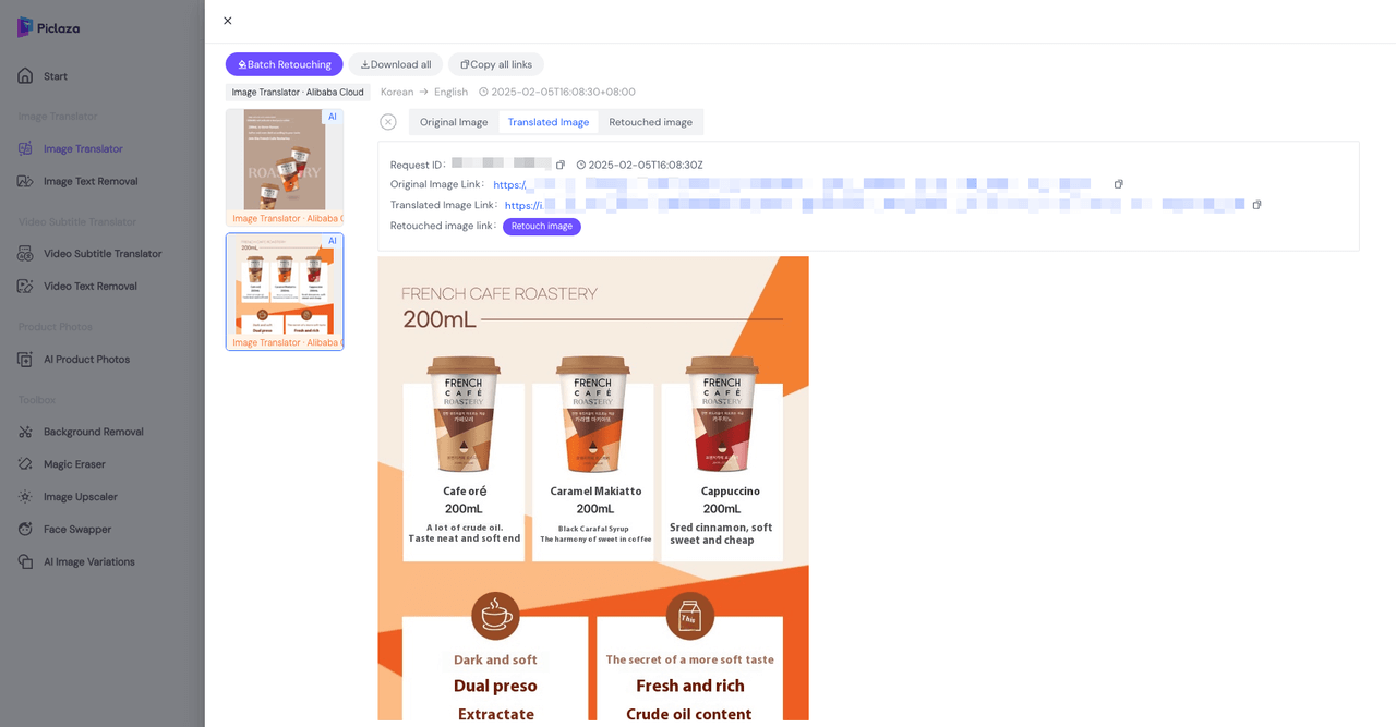
Once we have completed the image translation, click on the image to access the page below. By clicking “Go to Refinement,” you will enter the refinement page.
Introduction to the Refinement Page Features.
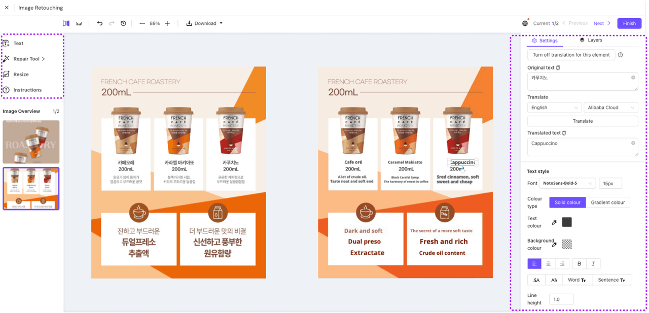
On the left side of the page, you’ll find the “Text,” “Repair Tool,” and “Resize” features. On the right side, you can adjust the effects of the translated text in the image, including “Translation Text,” “Text Style,” “Text Outline Settings,” “Shadow Settings,” and “Position Information”
Case Study Sharing
Using the image below as an example, we will demonstrate how to use the Refinement Editor to make adjustments to the translated image. 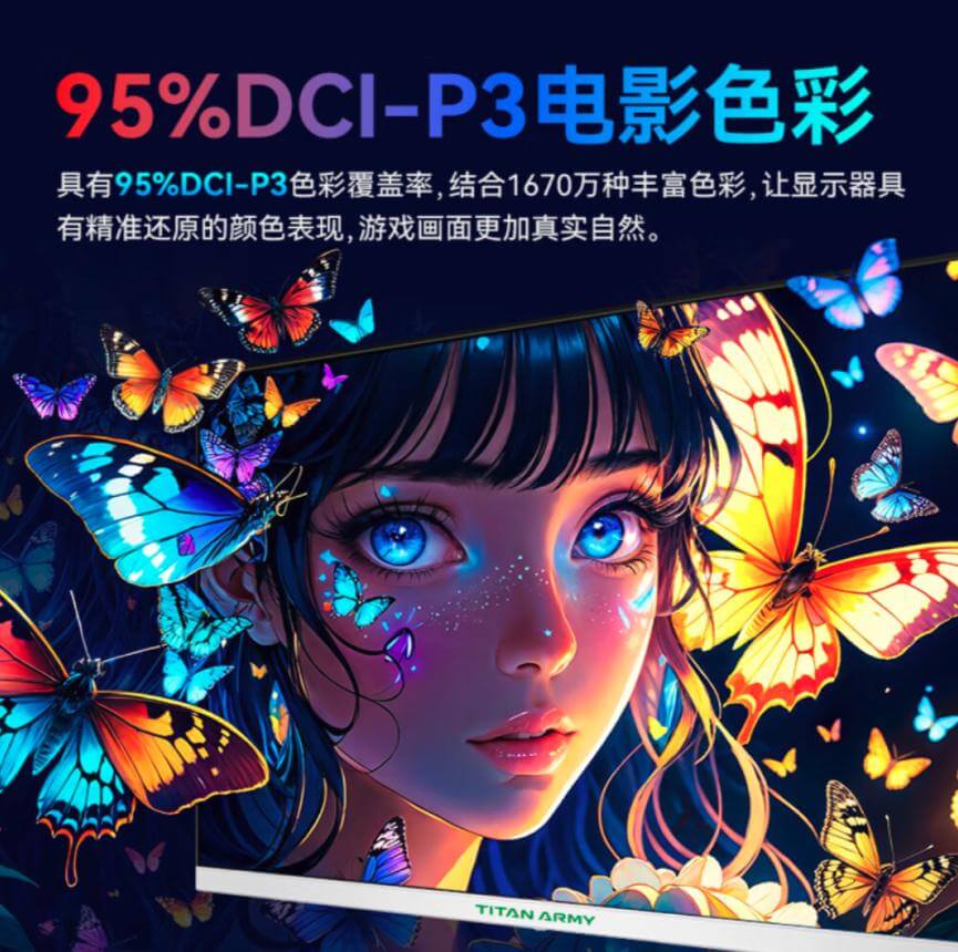
Step 1: First, translate the image, then enter the Refinement Editor.
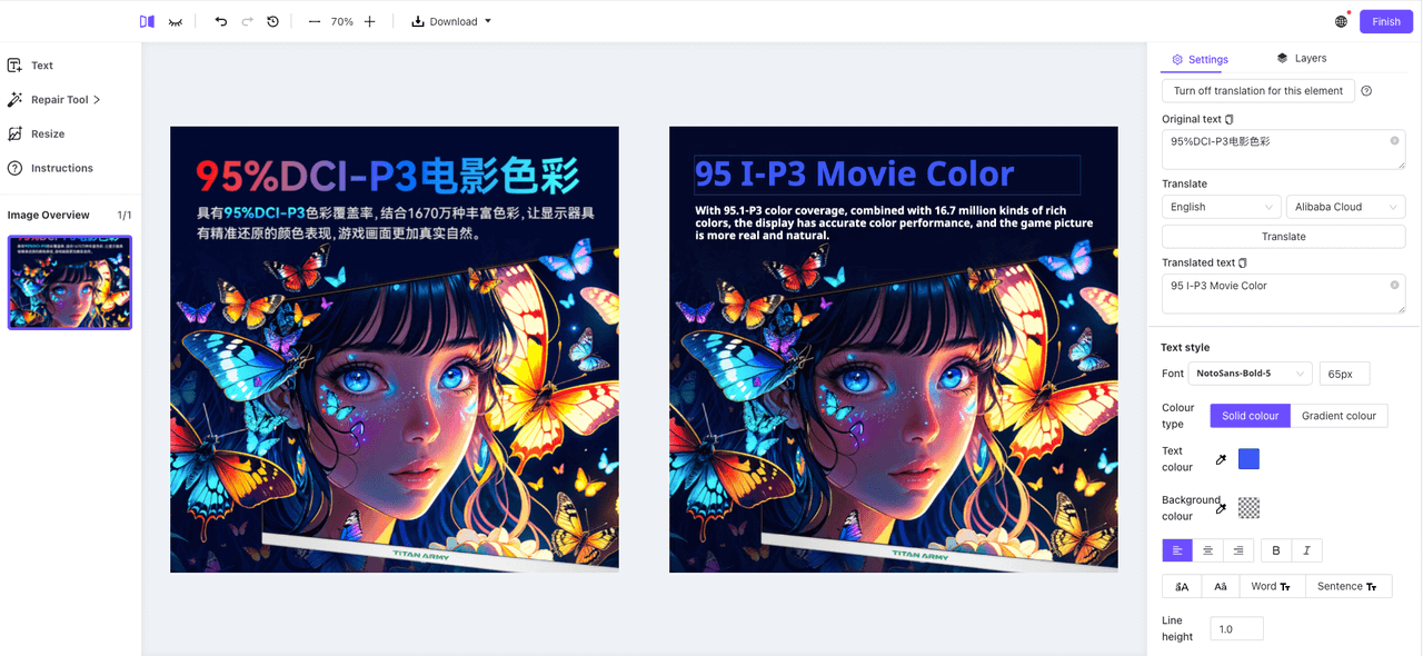 If some text hasn’t been translated correctly, we can manually make adjustments.
Step 2: Adjust the special effects of the title.
The top title of the translated image is missing the previous gradient effect. Let’s add that effect now.
In “Text Style,” select the “Gradient” color type. You can set the “Gradient Direction” and the “Start/End Gradient” colors. We’ll choose Solid colour and then set the desired gradient colors.

Next, for the text on the canvas, you can adjust the size and position as needed.
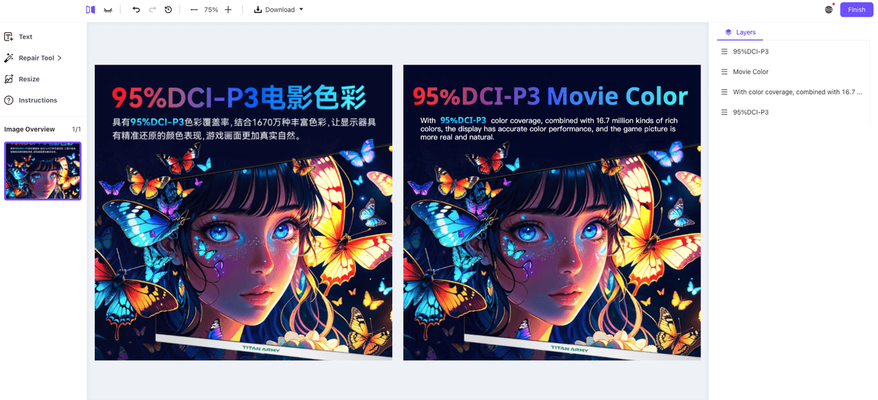 Done!
Done!Now, the layout and colors are consistent with the original image!
Here are some helpful design tips:
- Make the Most of Typography Rules
- When choosing fonts for translated text, try to match them with the product’s characteristics
- Tip: For titles, opt for bold, full fonts that offer high readability and make a strong visual impact.
- When choosing fonts for translated text, try to match them with the product’s characteristics
- Follow the Four Basic Principles of Layout Design
- Proximity: Place related text elements closer together to show their connection.
- Contrast: Create contrast between visual elements (fonts, colors, sizes, shapes, line width, spacing, etc.) to make the design more dynamic.
- Alignment: Never place elements randomly on the canvas. Every element should have a visual relationship with another, creating a clear, refined, and fresh appearance.
- Repetition: Repeat visual elements like color, shape, font, or size throughout the image to increase structure and reinforce consistency.
That’s all for the introduction to Piclaza’s Refinement Tool! Give it a try and see how it enhances your designs!
